Cancer registry data is a rich public resource. Data collected by registries like the Greater Bay Area Cancer Registry are essential for tracking the burden of cancer regionally, statewide, and nationally. These data visualization tools help make it easier to access and interpret available cancer registry data.
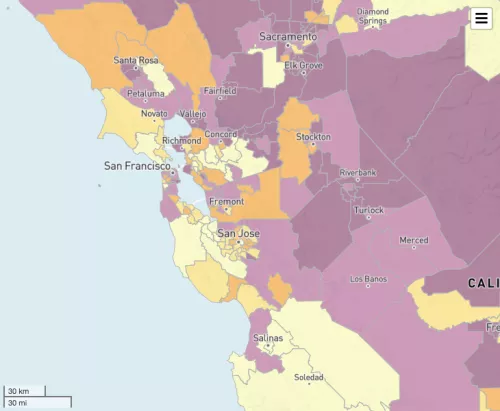
California Health Maps is an interactive mapping tool of health data for geographies beyond the county level in California. You can map cancer incidence for 12 of the most common invasive cancer sites and filter by sex, race, and ethnicity.
Customized dashboard for querying and visualizing population-based cancer incidence and mortality data for the catchment area of the UCSF Helen Diller Family Comprehensive Cancer Center.
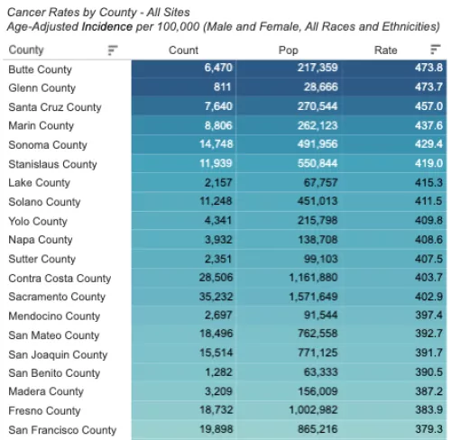
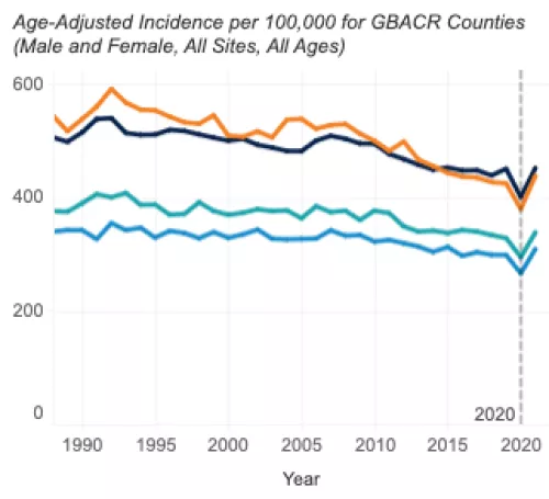
The Greater Bay Area Cancer Registry Dashboard provides both cancer incidence and mortality rates by county, race, ethnicity, sex, age, and year of diagnosis.
Other Cancer Data Visualization Resources


